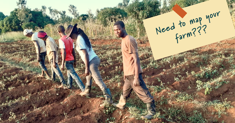
How human-centred design enabled farmers to map fields 100% remotely in Kenya

6th Grain are using learn.ink to create digital courses to acquire farmers. However, before they were able to get there they needed to do a major redesign of their free Android app for farmers, Field Focus Light. They had a problem though, it went a little something like this:
"We've built a sophisticated smartphone app that's free for our users... it's got really powerful features and when users understand them they agree that they are very valuable... but nobody can actually use it unless we spend an 20 minutes telling them how... this won't scale!"
A usability problem with Android apps for farmers
Maybe the above sounds familiar (if you come from a company using tech to reach users in East Africa). In 6th Grain's case, the video below summarises some of the challenges farmers faced in using the app.
Achieving huge improvements in usability
6th Grain asked the learn.ink for some bespoke support around this issue. They wanted to know how to achieve the same delight and ease-of-use farmers report when using learn.ink trainings for their Android app. We teamed up with a star farmer on the ground in Kenya, Catherine Kamanu, to solve the problem.
Catherine provides her assessment of the final version of the Field Focus Light app below. Keep in mind that before we redesigned the application, virtually no farmers could map their fields using the app without significant support. Cathy's feedback throughout multiple iterations is what helped us build an interface that worked.
How user testing helped us get there
Any good human-centred design process starts with in-depth interviews and feedback from the real end users involved, so the learn.ink team and Catherine digitally recruited and talked to a mix of farmers, agronomists and younger individuals potentially interested to work as rural agents.
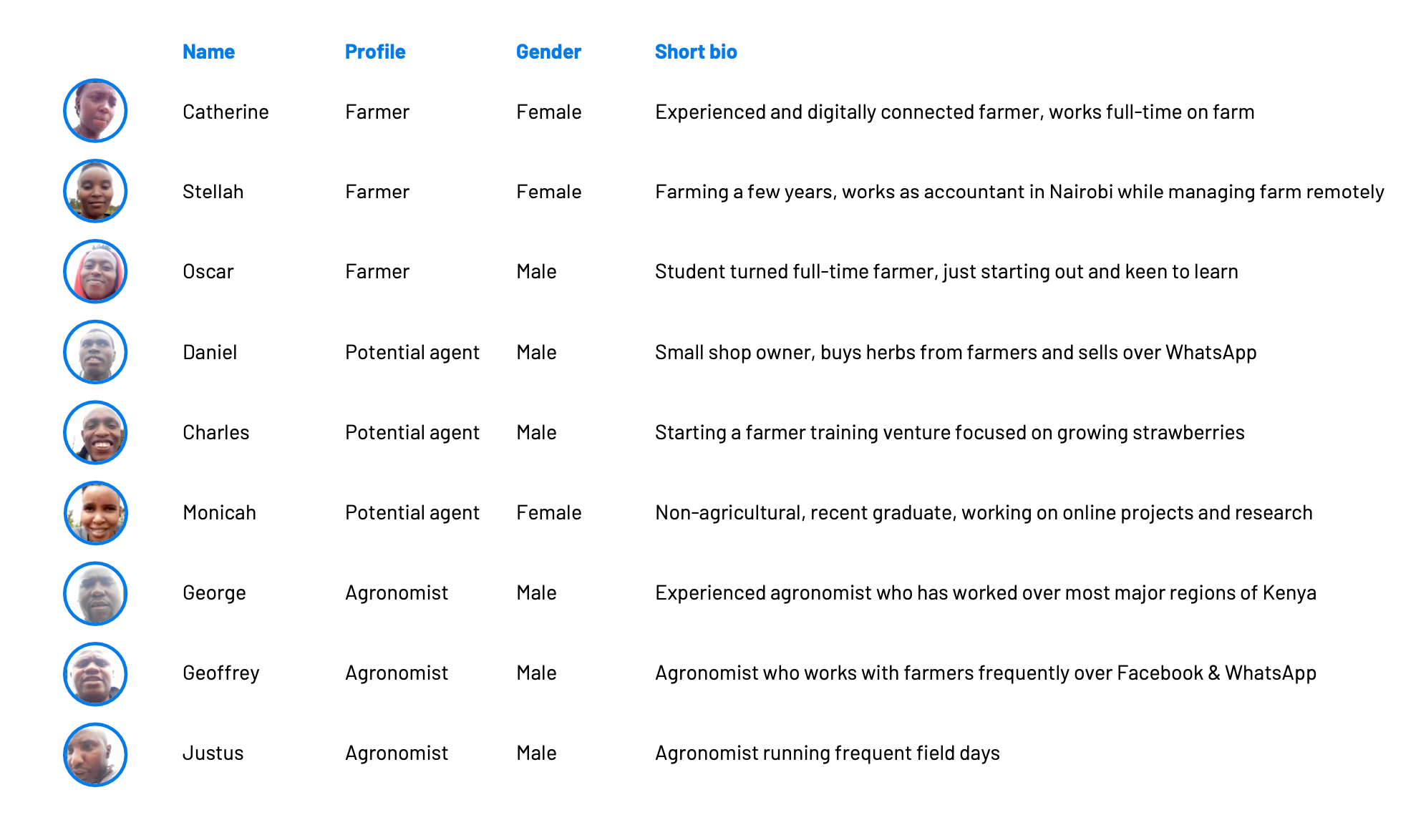
We conducted 100% remote interviews between the UK and Kenya with farmers. We used the learn.ink system itself to help guide and capture critical information from farmers. A huge thanks to our amazing testers, who provided incredible feedback that helped guide the design and development teams moving forward.
The results from a usability audit
The learn.ink team provided the 6th Grain software development team a comprehensive usability audit report. We highlighted three major areas for improvement to the app that we believed, once resolved, would enable farmers to map their field boundaries without the need for costly and time consuming support. What was important was that once farmers realised what Field Focus could do for them they were incredibly enthusiastic. The issue was that the value was hidden out of view behind some challenging parts of the interface.
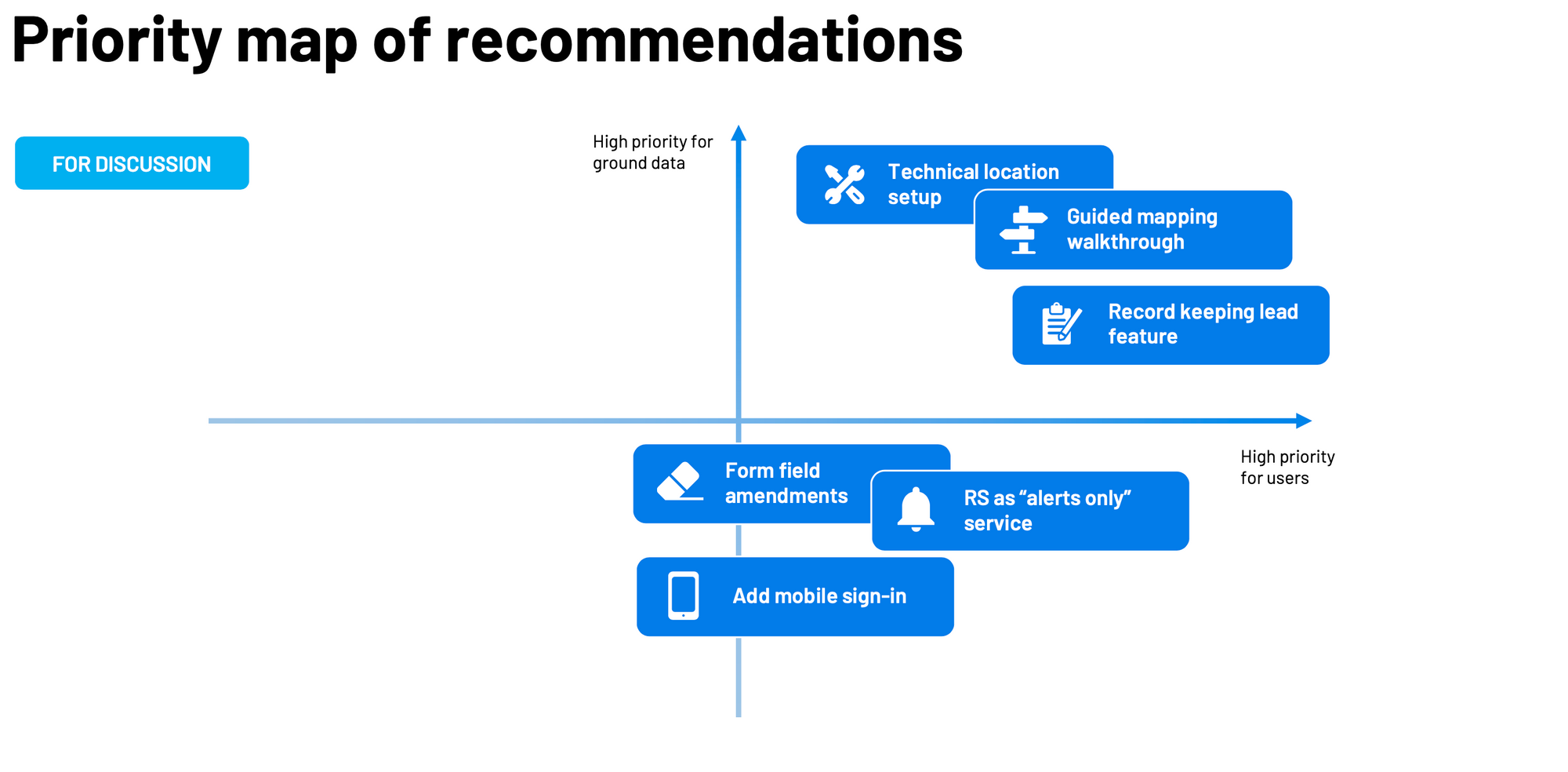
The three major areas for improvement were:
- Technical location setup - minimise requirements for the user to setup their own device for field mapping, e.g. by providing them in-app prompts to turn on location as well as informing the user when the GPS chip on their device was providing a reading (avoid using cell tower location readings, which are too inaccurate in this context).
- Guided mapping walkthrough - testers themselves provided us excellent ideas and feedback about how they would like the guidance for the field mapping process to work, e.g. "I wish the instructions were on the screen", "an easy procedure, step 1, step 2, step 3, etc.". The user feedback was so good that we didn't even need to do much design, we just needed to listen to what they were suggesting.
- Record keeping is a lead feature - initially the Field Focus app boasted advanced crop analytics features as a leading feature, but it quickly became apparent that there was a more valuable feature for farmers: keeping better records with associated costs. Once farmers had framed a field boundary it made sense to keep notes on what activities they had conducted within that boundary, when they had occurred, and what the costs associated with each activity were. People didn't appear to have a good solution for this, but there was a real need there.
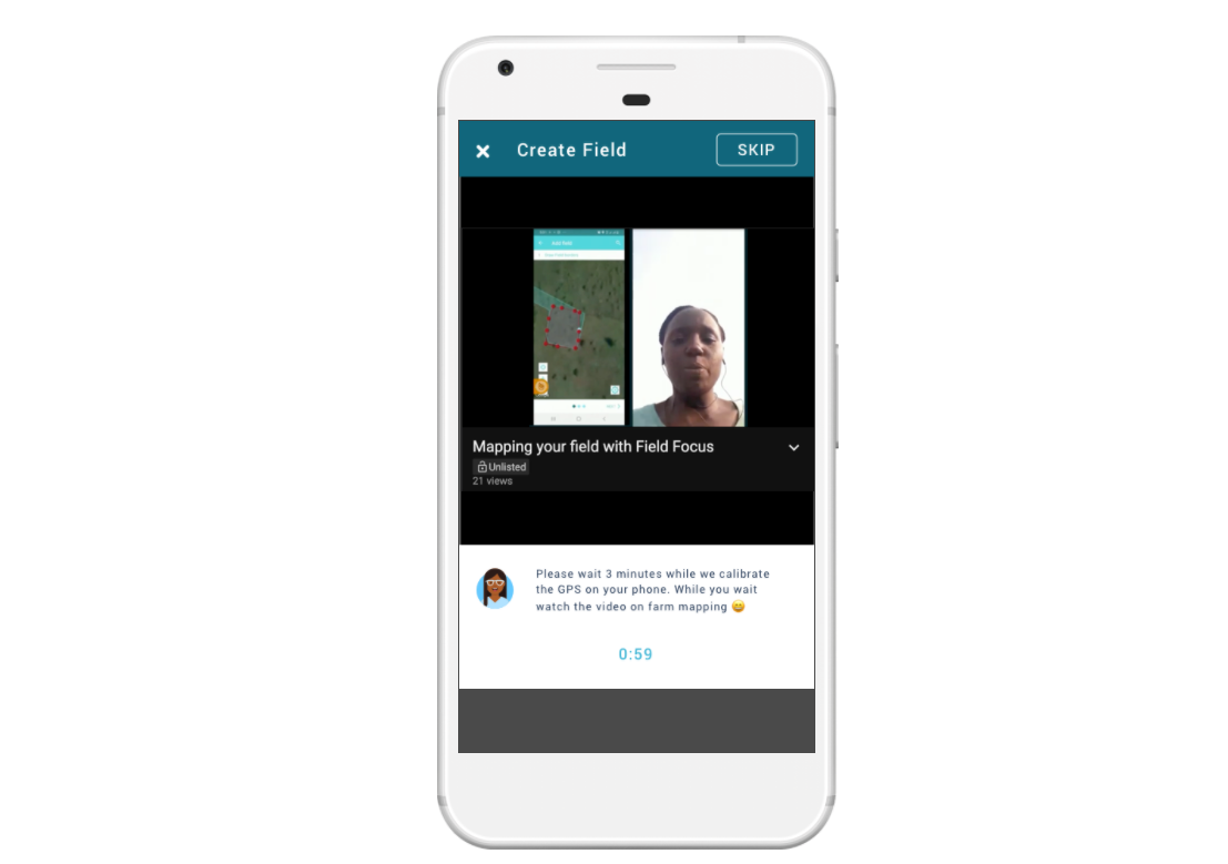
Prototyping new features
Understanding the problem is one thing, but having a clear design that would resolve them is quite another. This is why the 6th Grain team commissioned the learn.ink design team to create a prototype to demonstrate how updates to Field Focus could resolve the challenges outlined. Our team created a click-through prototype that could be quickly tested by both 6th Grain and our original testers. You can check it out yourself below (click on the image or this link).
This design is all well and good, but who's to say it would work? The answer is simple, ask the testers. To demonstrate what kind of difference in results we could expect we conducted user tests with a mix of previous and new testers. We asked the previous testers whether they thought the new prototype design was better and why, and we sense-checked some of this with new testers (to help ensure our old testers weren't just being nice!). Again you can see a snapshot of these results below.
Going on to train and acquire farmers for $1/user
With a redesign implemented, and demonstrably working for farmers 6th Grain were keen to move to the next phase: getting Field Focus Light out to farmers. But the critical lesson here is that you must start with digital products that work for your users, and there is no short-cut out of user testing.
Read the case study on how they reached over 2000 farmers for 1 USD per user